How to deploy Meteor on Amazon EC2

Update – April 19, 2012: I’ve reworked this post into a new, improved remote deploy script for Meteor, named Meteoric. You can read about it and install it from Github and soon in the Meteor Book.

Meteor is an ambitious open source real-time Web framework, based on Node.js and MongoDB.

Meteor hit version 0.5 a week ago and some people are starting to use it for production apps. Telescope and Sidebar are examples of such apps that were recently launched (both were created by Sacha Greif). However, the hosting options for production-ready Meteor apps are still limited, with most people opting to host their apps on Meteor’s own hosting platform *.meteor.com, or on Heroku.

Performance-wise, as Meteor apps generate lots of real-time data exchange between server and clients, we’re still in a bit of a grey area. I thought it would be interesting to deploy a Meteor app on EC2 and test the app’s performance. So here’s how you can deploy a Meteor app on EC2:

  1. Launch a 64-bits EC2 instance.
    I launched a Medium instance running Ubuntu Server 12.04.1, the latest Long-Term Support release of Ubuntu Server. Then connect to your instance in the usual way.
  2. Install Node and npm:

     
    sudo apt-get install python-software-properties 
    sudo add-apt-repository ppa:chris-lea/node.js 
    sudo apt-get update 
    sudo apt-get install nodejs npm
    
  3. Install Meteor
    curl https://install.meteor.com | /bin/sh
  4. Install MongoDB:
    sudo apt-get install mongodb
  5. Checkout your Git repo. At that point, you can install git (apt-get install git) and clone your Meteor app’s repository (for example for a Github repo: git clone https://github.com/SachaG/Telescope.git), for example in /home/meteor.
  6. Bundle your app. This is where it gets a bit trickier. You have to bundle your Meteor app, i.e. according to the canonical documentation : “generate a fully-contained Node.js application in the form of a tarball”. As you’re running the Node app on this very server, you don’t have to upload the tarball anywhere however – you just have to untar it there (it would actually be handy to be able to “bundle as a directory, not a tarball”).
     
    cd mymeteorapp 
    meteor bundle bundle.tgz 
    tar -zxvf bundle.tgz 
    
  7. Run the app. At this point you have your bundled Node.js app in the bundle/ directory, and you’ll run it as any Node server. In particular, if you want your app to be accessible via HTTP you need to specify port 80. You also need to specify your MongoDB installation’s location, and you may have to specify your app’s ROOT_URL as well.
    
    PORT=80 MONGO_URL=mongodb://localhost:27017/sidebar ROOT_URL=http://ec2-23-20-113-59.compute-1.amazonaws.com/ node bundle/main.js
    

Optional:

  1. Install meteorite (a package manager for Meteor) if your Meteor app requires it:
    npm install -g meteorite  

    Then you can just replace every meteor call with Meteorite’s command line, mrt (mrt bundle, etc.)

  2. If you want your server to not terminate when you close your connection to your server, you can use nohup:
     
    PORT=80 MONGO_URL=mongodb://localhost:27017/sidebar ROOT_URL=http://ec2-23-20-113-59.compute-1.amazonaws.com/ nohup node bundle/main.js &
    

    Of course, you can use less basic “daemonizing tools”, like Forever (Node) or monit.

  3. If you want to import a dump of your MongoDB data (say from Heroku): your dump is most probably in BSON form, so you should do:
    mongorestore --db yourmeteorapp dump/

EC2 Meteor Community AMI

Here’s an Ubuntu-based Meteor AMI if you need one: Meteor Community AMI.

If you liked this article, feel free to comment on Hacker News!

How to design a good native-looking WordPress Admin icon

For my previous project, Popshop (which is, you guessed it, a WordPress theme), I wanted to produce a set of native-looking WordPress Admin icons. I like the WordPress admin panel a lot and I wanted my Theme to really blend in — I was also inspired by this post by designer Laura Kalbag. This post serves as a way of documenting what I did, and hopefully helps WordPress developers produce subtle icons that are consistent with WordPress’ native UI.

The End result, with Menu page selected (Left) and inactive (Right)

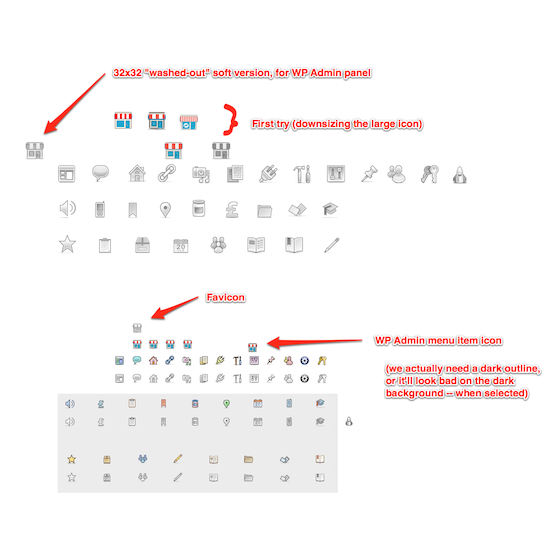
There are actually two different icons that you need to produce, at different sizes (see Figure below):

  • A Menu page icon, which is the icon that sits in the sidebar. You can easily set this icon from your Theme or Plugin, but be aware that it actually doesn’t work in the same way as the native icons with respect to their active/inactive behavior: native icons (i.e., Posts, Media, etc. up to Settings) have two sprited states, which is why they can be monochromatic or colored. Theme- or Plugin-defined custom icons, however, are applied a 0.6 CSS opacity when inactive (they are at 1.0 opacity otherwise).
  • A Screen icon, which usually appears on your Theme options or Plugin settings page.

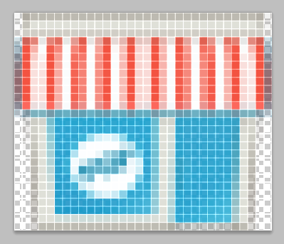
Let’s start by resizing our full-size logo to a width of 32px, using Photoshop. I found that Photoshop’s bicubic downsampling algorithm works best, but in any case, the result won’t look too good:

Yes, it’s very blurry… The next step is to remove the excessive details, that look good at full-size but make no sense at 32×32. The “Pop” Flash on the Window is one of those details.

Then, you can slightly resize and move some elements of the object to make it more legible at small sizes.

A really useful thing to do to help you design an icon is to paste the native WordPress icons in the document you’re working on (here, the 16x16px Menu page icons). I find it really helps the style to blend in.

The next step is to repaint the blurry pixels, so that lines are not blurry or antialiased anymore. This sounds a lot more tedious than it really is, actually.

The one thing to be looking for here, is that, as hinted in the intro to this post, your custom menu page icon has to work on both a dark (when active) and a light (when inactive or on hover) background.

This means it’s a good idea to use a strong dark outline, and semi-transparent pixels (instead of hard-coded grey pixels). On the Figure above, see for example the difference between the first Popshop icon on the left, and the one on the right (which is the final one).

This is why it is really important to test your design on a dark background :

Another feature you might want to add to your icon to make it more WordPress-friendly is the grey drop-shadow below the icons. Again, don’t use hard-coded gray, use semi-transparent black pixels instead (to make sure they look equally good on light and dark backgrounds).

The Screen icon is larger (up to 34x37px), so you can add a few more details back into it (in my case, the door knob). Also, the surfaces are much larger now, so it’s a good idea to use very subtle color gradients on areas ; for example in the coloured icon in the image above, the wall is slightly gradiented, as are the red stripes.

The grey version of the icon above also seemed a bit too dark, so I had to tweak a little more to give it a more subtle, kind of “washed-out” look that’s consistent with WordPress’ native UI.

Voilà ! This is basically how I designed and produced my WordPress icons. You can find a working document I used here:

As I said, I couldn’t use the monochromatic version of the Menu page icon (the small one), but it ended up making for a pretty cool favicon 🙂

Extending Options Framework for WordPress

I’m currently building a WordPress Theme that is very versatile and has a fairly high number of Theme options (although I’m trying to abstract many of them from the end-user to keep things simple).

I was very surprised to see that WordPress itself doesn’t include a way to easily create your own Settings panels, in the same way that for example it includes a class/library for creating admin list tables (like the ones for Posts or Links, for example) that you can extend to build your own list tables without having to write any markup.

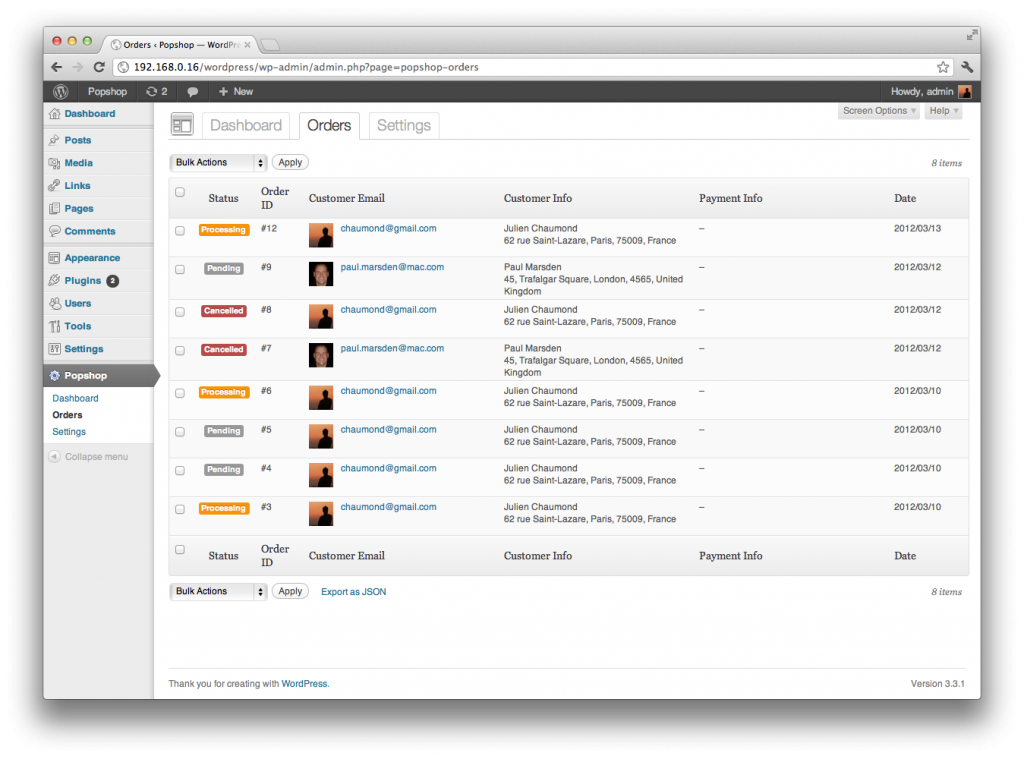
An example of an Admin List table, built on top of WordPress' native features.

There are however a couple of external libraries that you can use to abstract the creation of Options panels: the two most mature ones (at first glance) are Options Framework from Devin Price, and the UpThemes Framework from Themes developer UpThemes. Both look good, are well-coded, and have a decent following and activity on Github.

I chose to go for Options Framework because it is a little more “barebones”, its development is very iterative and ongoing, and most of all developer Devin seems to be really helpful and responsive to both Github pull requests and comments on his website.

There are actually two versions of Options Framework: a Plugin version, and a “Theme” version that you can actually use as a library. I am mostly interested in the Theme version because I want my theme to be self-contained and to be able to provide extra flexibility.

Which brings us to the core of this post: how to actually extend Options Framework to make it more customizable and be able to add more functionality?

First, Options Framework is already reasonably extendable in the sense that it uses filters (notably, for data sanitization) and WordPress-type pluggable functions (i.e., functions definitions are enclosed in if ( ! function_exists( 'optionsframework_mlu_init' ) ) { } branchings).

However, for a few of my needs, I had to hack into Options Framework and add extensibility “hooks”. This post serves as a reference as to how I implemented these hooks.

First, I want to have my Theme Options WordPress submenu inside my Theme’s menu in the Admin panel sidebar, not under Appearance. This is actually documented by Devin (see Figure below), but still requires hacking the code directly, as there are several places where the appearance menu hook ('appearance_page_options-framework') is hardcoded. The way I propose to add extensibility on this point is through the use of a constant named OPTIONS_FRAMEWORK_ADMIN_PAGE (Options Framework already uses constants like OPTIONS_FRAMEWORK_URL and OPTIONS_FRAMEWORK_DIRECTORY).

Then, there are things that I wanted to configure in the Frontend behavior of Options Framework, that were hardcoded in the JS file. I think it makes sense to be able to configure or extend the JS behavior from outside Options Framework. For example, I don’t like the fading effect on Options tabs, so I added a fadeDuration setting (that you can set to 0 from outside the library), but kept its default value of 400 inside Options Framework.

To do this elegantly, I actually used the jQuery extend function, which is what jQuery plugins use to define defaults and options. In turn, I am able to configure the JS values from outside Options Framework, with code like the following:

add_action('optionsframework_custom_scripts', 'optionsframework_custom_scripts');

function optionsframework_custom_scripts() { 
    
    // The following is my attempt at adding some (more) parametrability to Options Framework's JS.
    
    $of_options = array('fadeDuration' => 0,
                        'navTabSelector' => '.nav-popshop-settings a');
    
    echo sprintf('<script type="text/javascript">/* <![CDATA[ */ var Of_options = %s; /* ]]> */</script>', json_encode($of_options));
    
}

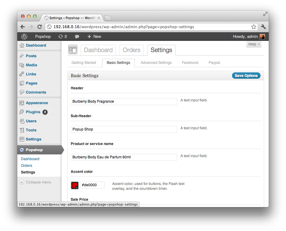
In my theme, I also want to keep a toplevel set of tabs (“Dashboard”, “Orders”, “Settings”) on the Settings page, so I need to be able to specify to the Javascript file that the set of tabs generated by Options Framework is hooked on a different CSS selector. I also style the set of tabs a little differently (from outside the library as well):

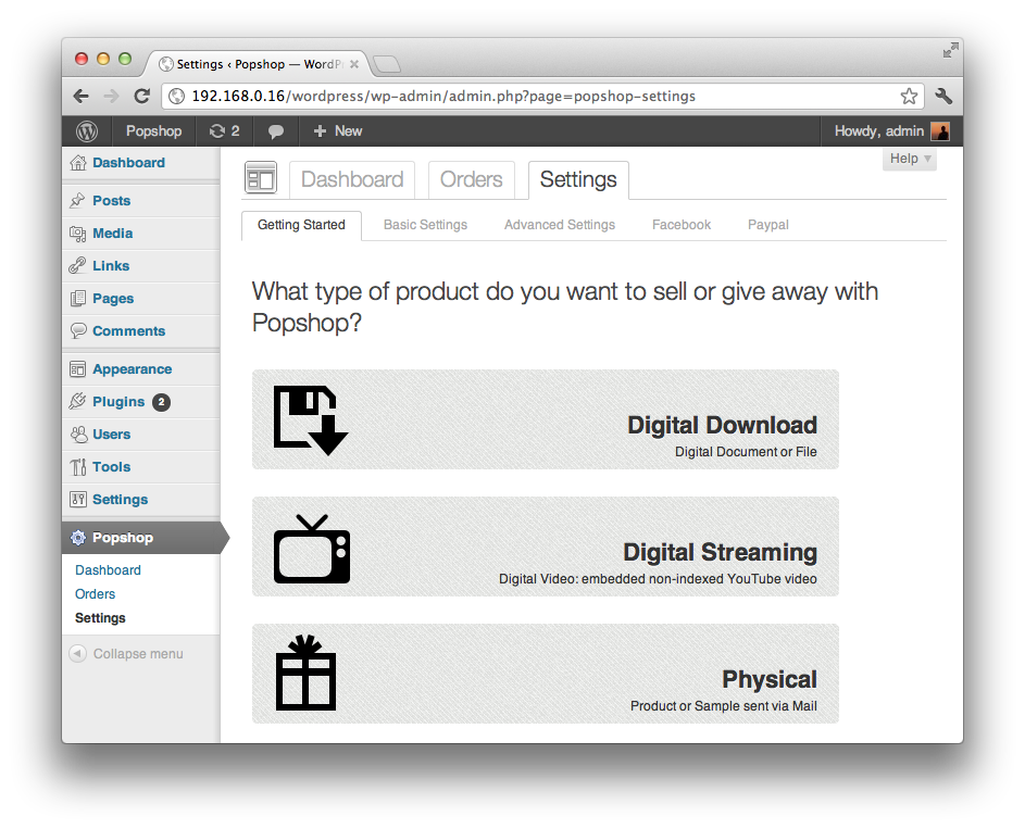
My Theme also have a “Getting Started” page that is integrated with the Options Framework page. This “subpage” interacts with the options page (for example, it has a different styling), and I needed to know when tabs were clicked. I did this by triggering custom jQuery events (named of-tab-active) from Options Framework. That way, I can hook on this event like this:

// Hook into Options Framework's custom tab selection event, in order to style specific options groups differently.
$(".nav-popshop-settings a.nav-tab").bind('of-tab-active', function(){
    $('#optionsframework').removeClass().addClass('postbox').addClass($(this).attr('id'));
});

My differently styled Options "Getting Started" page

Another thing I did (but which didn’t require any change to Options Framework) was to duplicate the “Save Options” button in Javascript, and place it on top of each subpage. When the button is only at the bottom of the page, I’ve found that it’s easy to miss it and forget to save changes (in particular as more and more apps save settings “transparently”). This is pretty hackish, but this is how I did it:

// Copy "Save Options" submit buttons at the top of pages (Settings page)
var submit_button = '<input class="button-primary top-button" type="submit" value="' + $("#optionsframework-submit input[name='update']").attr('value') + '" name="update">';
// Sadly there is no jQuery outerHTML function so we have to reconstruct the markup ourselves...
// We also add a custom class ("top-button").
$("#optionsframework h3").append(submit_button);
// We append into h3 tags, although this is not semantically ideal.

Another thing that I thought about (though I ended up not needing it at this point) was the ability to extend the types of interface elements used in Options Frameworks (text, textarea, select, etc.) and defined in optionframework_fields(), so that plugins would be able to define their own interface elements (sliders, etc.) without having to hack into Options Framework.

This is basically what I did to extend Options Framework. All in all, this is a great library! And it has helped me develop my Theme considerably. My Pull request can be found on Github.

Le PDF du livre en téléchargement gratuit

Le PDF du livre est désormais en téléchargement gratuit sur Productism : http://productism.com/product/2953801200-social-commerce

Productism (ma startup donc) est un site social où les utilisateurs (il faut Facebook ou Twitter pour s’inscrire) commentent et se recommandent des produits. Donc n’hésitez pas à commenter le livre directement sur Productism 🙂

[Présentation] L’architecture du Web social en e-commerce

Une lecture très intéressante sur le Social commerce : Marcel Weiss, de l’excellent blog allemand Exciting Commerce, décrit dans les slides ci-dessous comment les principaux paradigmes d’interaction du Web social sont de plus en plus utilisés en e-commerce :

  • The Follower Principle : les relations sociales asymétriques (comme sur Twitter) sont très adaptées au e-commerce (les liens sont plus “faibles” que de vrais liens d’amitié
  • The Stream : un flux temps-réel d’événement
  • The One Click Gesture : la plus petite unité de participation online (le bouton Like par exemple)
  • Share Connection to other web services : la possibilité de connecter son application aux autres réseaux sociaux pour en augmenter la distribution

On est en train de mettre en place tous ces principes dans ma nouvelle startup, Productism !