For my previous project, Popshop (which is, you guessed it, a WordPress theme), I wanted to produce a set of native-looking WordPress Admin icons. I like the WordPress admin panel a lot and I wanted my Theme to really blend in — I was also inspired by this post by designer Laura Kalbag. This post serves as a way of documenting what I did, and hopefully helps WordPress developers produce subtle icons that are consistent with WordPress’ native UI.
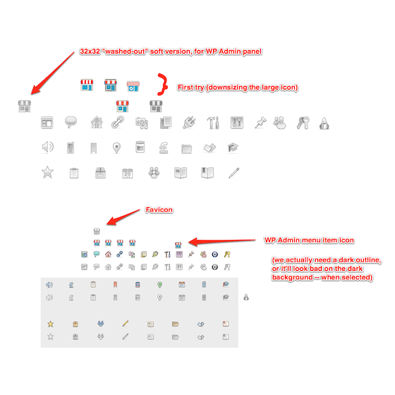
There are actually two different icons that you need to produce, at different sizes (see Figure below):
- A Menu page icon, which is the icon that sits in the sidebar. You can easily set this icon from your Theme or Plugin, but be aware that it actually doesn’t work in the same way as the native icons with respect to their active/inactive behavior: native icons (i.e., Posts, Media, etc. up to Settings) have two sprited states, which is why they can be monochromatic or colored. Theme- or Plugin-defined custom icons, however, are applied a 0.6 CSS opacity when inactive (they are at 1.0 opacity otherwise).
- A Screen icon, which usually appears on your Theme options or Plugin settings page.
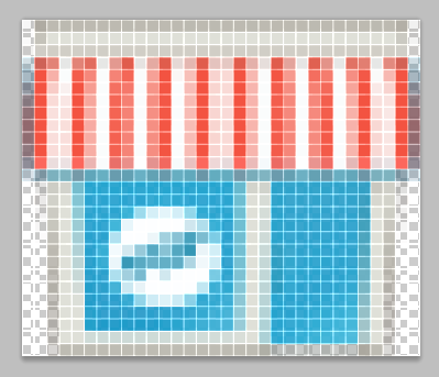
Let’s start by resizing our full-size logo to a width of 32px, using Photoshop. I found that Photoshop’s bicubic downsampling algorithm works best, but in any case, the result won’t look too good:
Yes, it’s very blurry… The next step is to remove the excessive details, that look good at full-size but make no sense at 32×32. The “Pop” Flash on the Window is one of those details.
Then, you can slightly resize and move some elements of the object to make it more legible at small sizes.
A really useful thing to do to help you design an icon is to paste the native WordPress icons in the document you’re working on (here, the 16x16px Menu page icons). I find it really helps the style to blend in.
The next step is to repaint the blurry pixels, so that lines are not blurry or antialiased anymore. This sounds a lot more tedious than it really is, actually.
The one thing to be looking for here, is that, as hinted in the intro to this post, your custom menu page icon has to work on both a dark (when active) and a light (when inactive or on hover) background.
This means it’s a good idea to use a strong dark outline, and semi-transparent pixels (instead of hard-coded grey pixels). On the Figure above, see for example the difference between the first Popshop icon on the left, and the one on the right (which is the final one).
This is why it is really important to test your design on a dark background :
Another feature you might want to add to your icon to make it more WordPress-friendly is the grey drop-shadow below the icons. Again, don’t use hard-coded gray, use semi-transparent black pixels instead (to make sure they look equally good on light and dark backgrounds).
The Screen icon is larger (up to 34x37px), so you can add a few more details back into it (in my case, the door knob). Also, the surfaces are much larger now, so it’s a good idea to use very subtle color gradients on areas ; for example in the coloured icon in the image above, the wall is slightly gradiented, as are the red stripes.
The grey version of the icon above also seemed a bit too dark, so I had to tweak a little more to give it a more subtle, kind of “washed-out” look that’s consistent with WordPress’ native UI.
Voilà ! This is basically how I designed and produced my WordPress icons. You can find a working document I used here:
As I said, I couldn’t use the monochromatic version of the Menu page icon (the small one), but it ended up making for a pretty cool favicon 🙂


